Design: Kejeha Johnson
Client: Ancient Elements
The Strategy
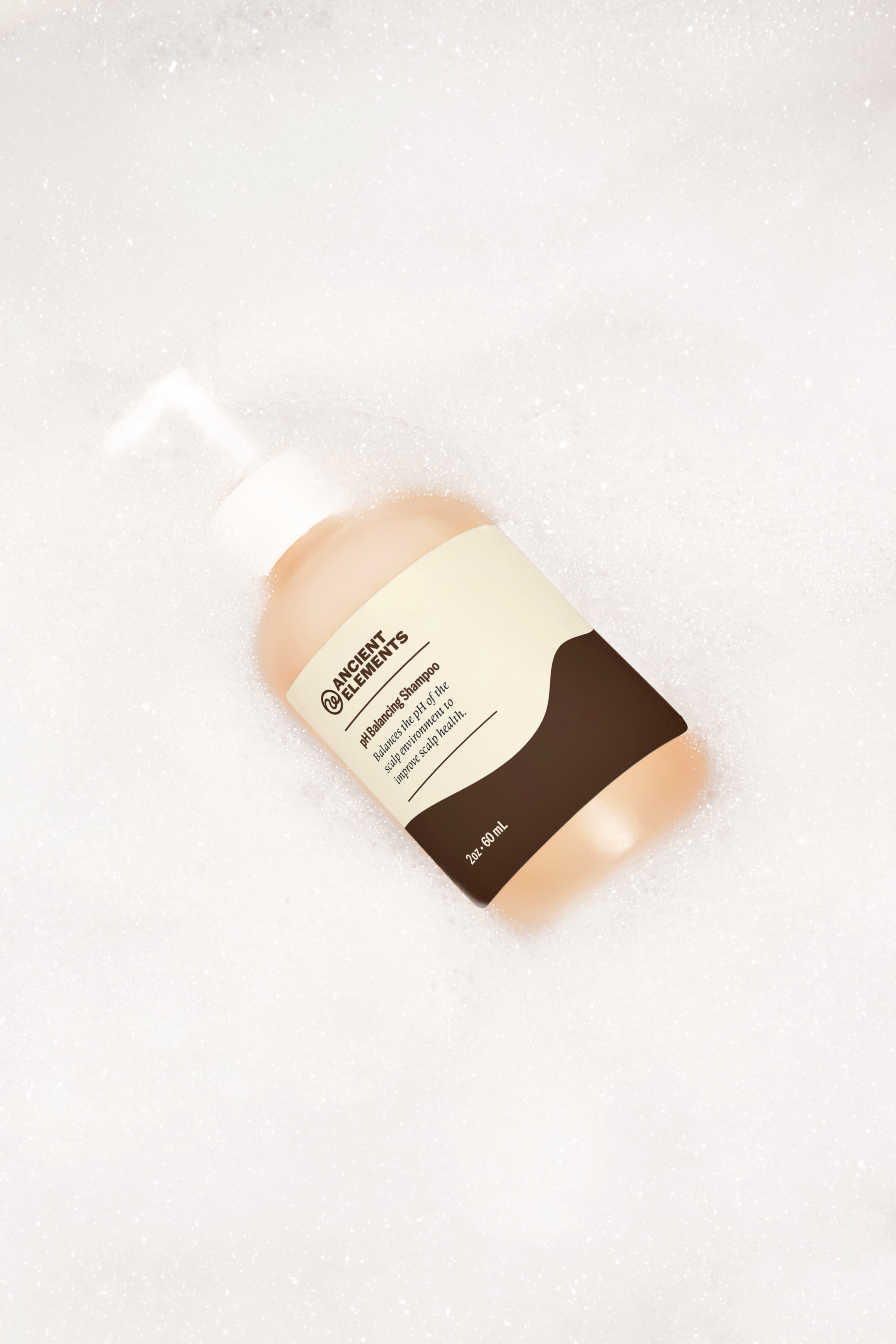
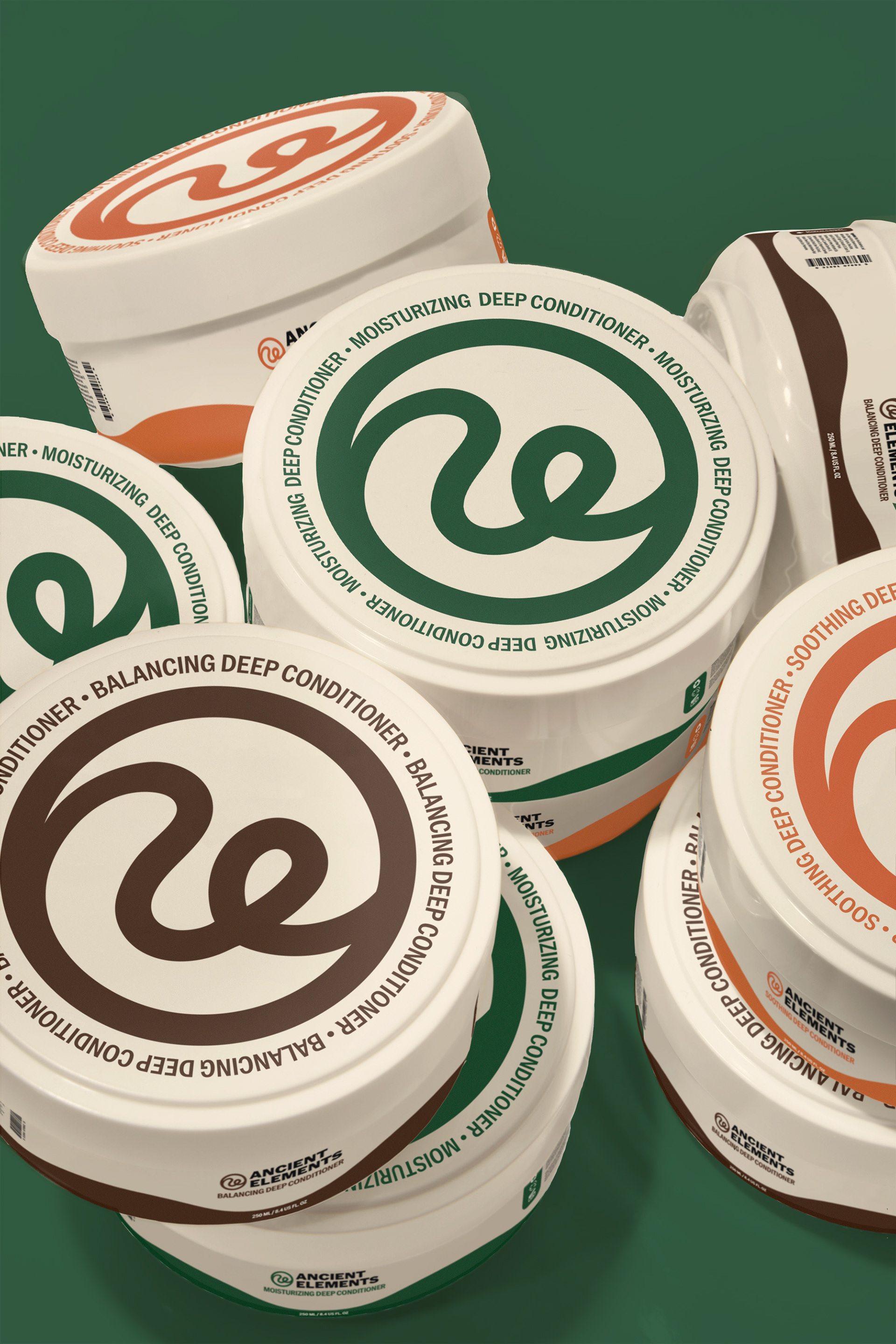
The client wanted to create a haircare brand that feels holistic yet scientific. To achieve this, I created a brand identity system and various forms of packaging that communicate how the company is bringing natural ingredients to the modern world.
Colour Palette
I decided to use colour to bring the company’s name to life. To do this, I used burnt oranges to represent the colour of rocks you might see in the Grand Canyon, a dark green to represent forests filled with pine trees, and a dark brown colour to represent tree trunks and soil. All the previous places and items mentioned are ancient and have existed for a long time, bringing the name “Ancient Elements” to life.
Typography
I decided to execute this by using a wide and modern sans serif font to give the brand a youthful and bold feel. On the packaging, I also used a mix of sans-serif and serif fonts to give the packaging a modern edge while giving a nod to an ancient past.
Branding Elements & Packaging
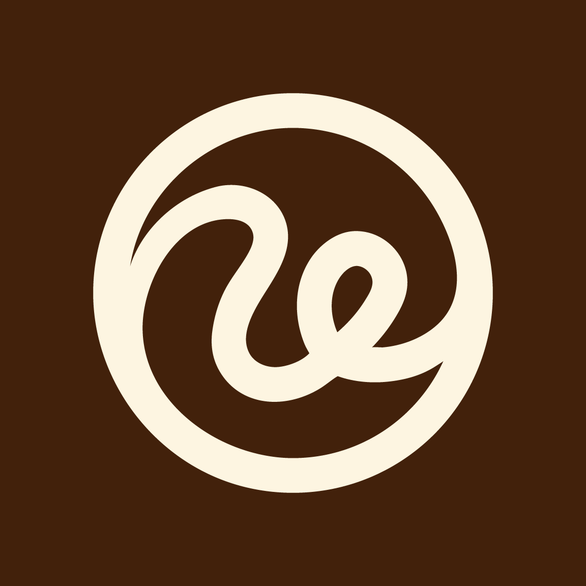
Icon Explanation
Ancient Elements is a natural haircare brand that wants its customers to feel at ease whenever they use one of their products. So, I made an abstract, flowing curl the icon to bring this feeling to life in the logo. Moreover, I designed the curl to look like the edge of a capital 'A' and a lowercase 'e' so that the icon can stand alone as a meaningful mark.
