Design: Kejeha Johnson
Project Type: Personal
The Strategy
The Lord of the Rings is a fantastic novel that has stood the test of time, and to celebrate the novel's approaching 75th anniversary, I decided to create a pop-up cafe. It was essential to find a way to generate buzz for the pop-up amongst people who live and breathe Tolkien and those who have not engaged with his work. To do this, I used colours that are predominantly seen in Middle Earth but made them way brighter to bring a bold and modern edge.
Colour Palette
I chose the main colours that I did to give a nod to many of the key places and people in The Lord of the Rings series. This choice will make people who know the series feel understood, and make people who don't know the series intrigued by the bright colour palette.
Typography
The Typography for this project needed to be attention-grabbing so that even if people were rushing by any signage, they would be intrigued about what was coming. To do this, I used a Century Gothic Pro, which is highly legible and can be very attention-grabbing when used with the right colours.
Branding Elements
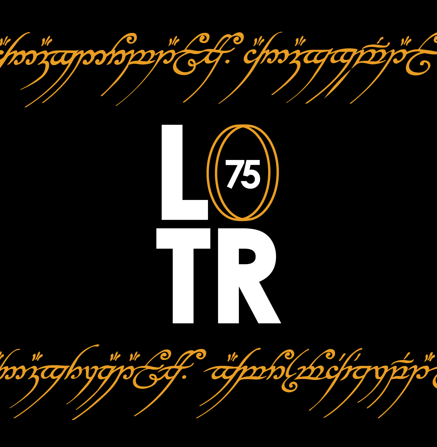
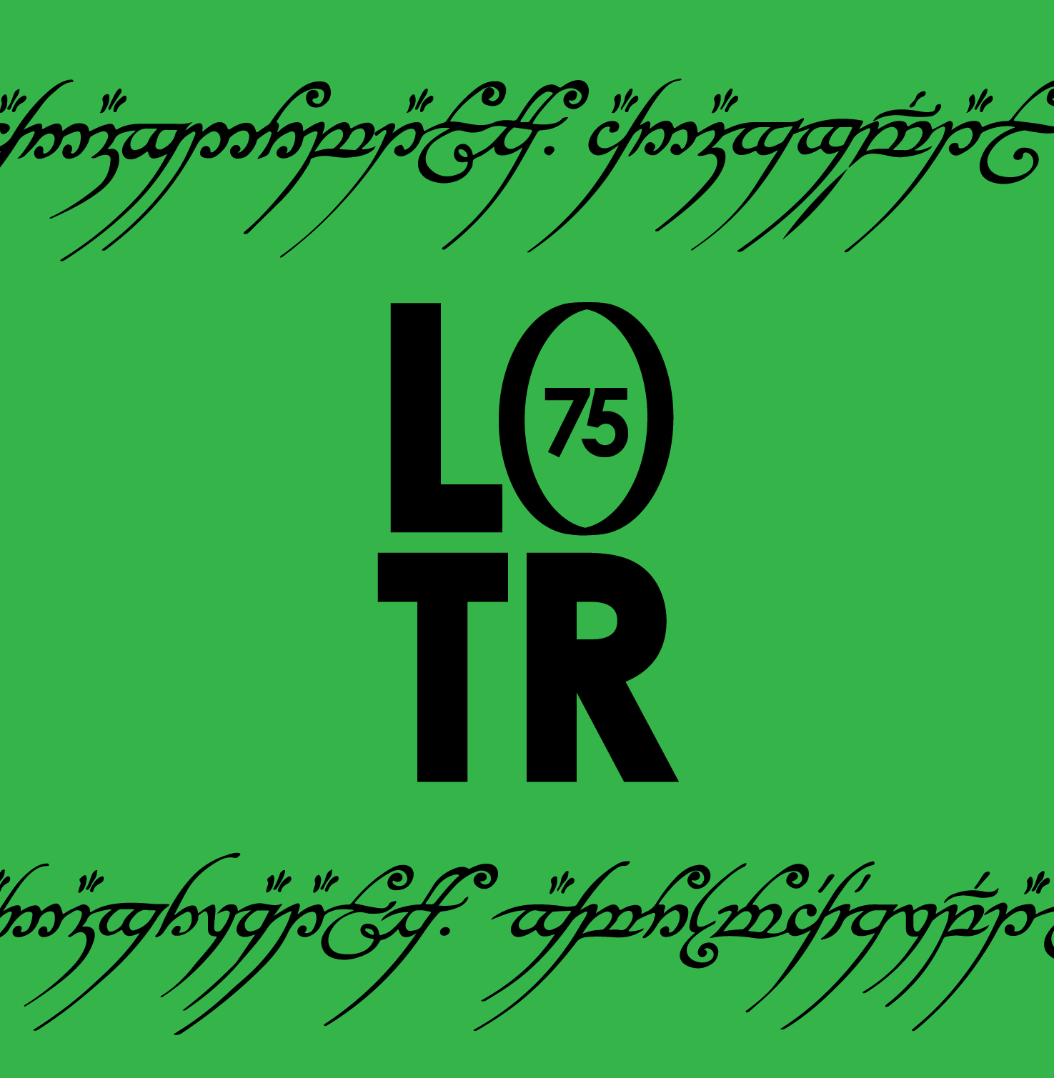
Logo Explanation
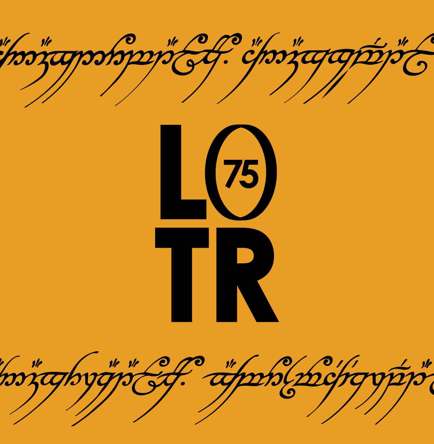
To ensure even the smallest items have a bold mark that is legible at varying sizes, I made three versions of the logo. They all have the same general parts to ensure brand recognition but have slightly different orientations to ensure the mark can be used anywhere it needs to be placed.
Instead of using the letter 'O' in the acronym LOTR, I used a ring that has a 75 inside to call back to the 75th anniversary celebration.
Branding Application

