Design: Kejeha Johnson
Project Type: Personal Project
The Strategy
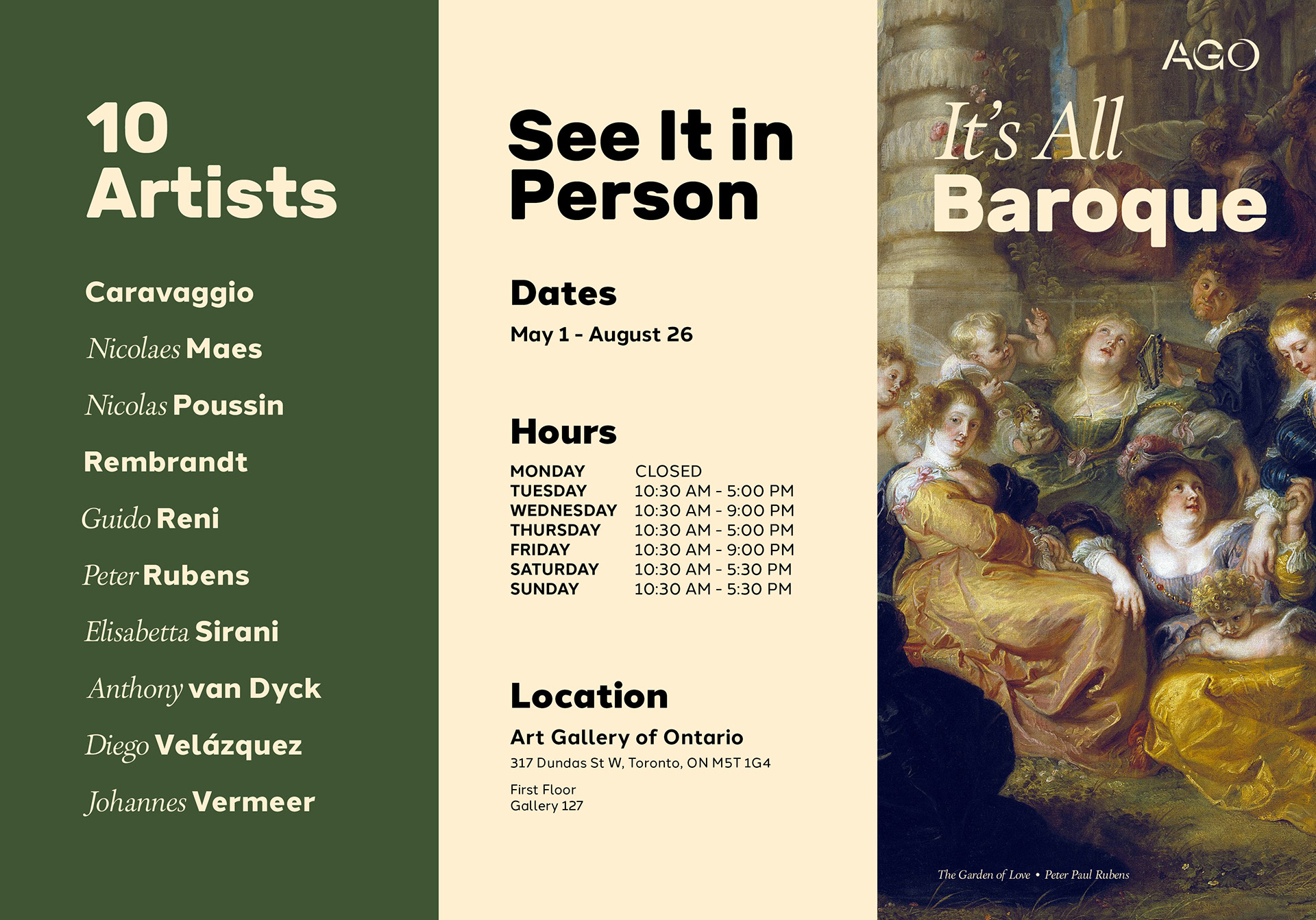
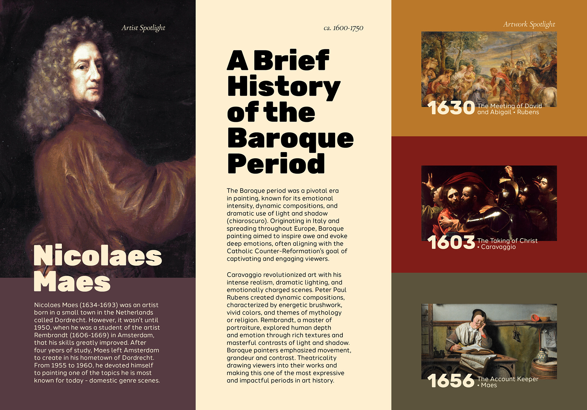
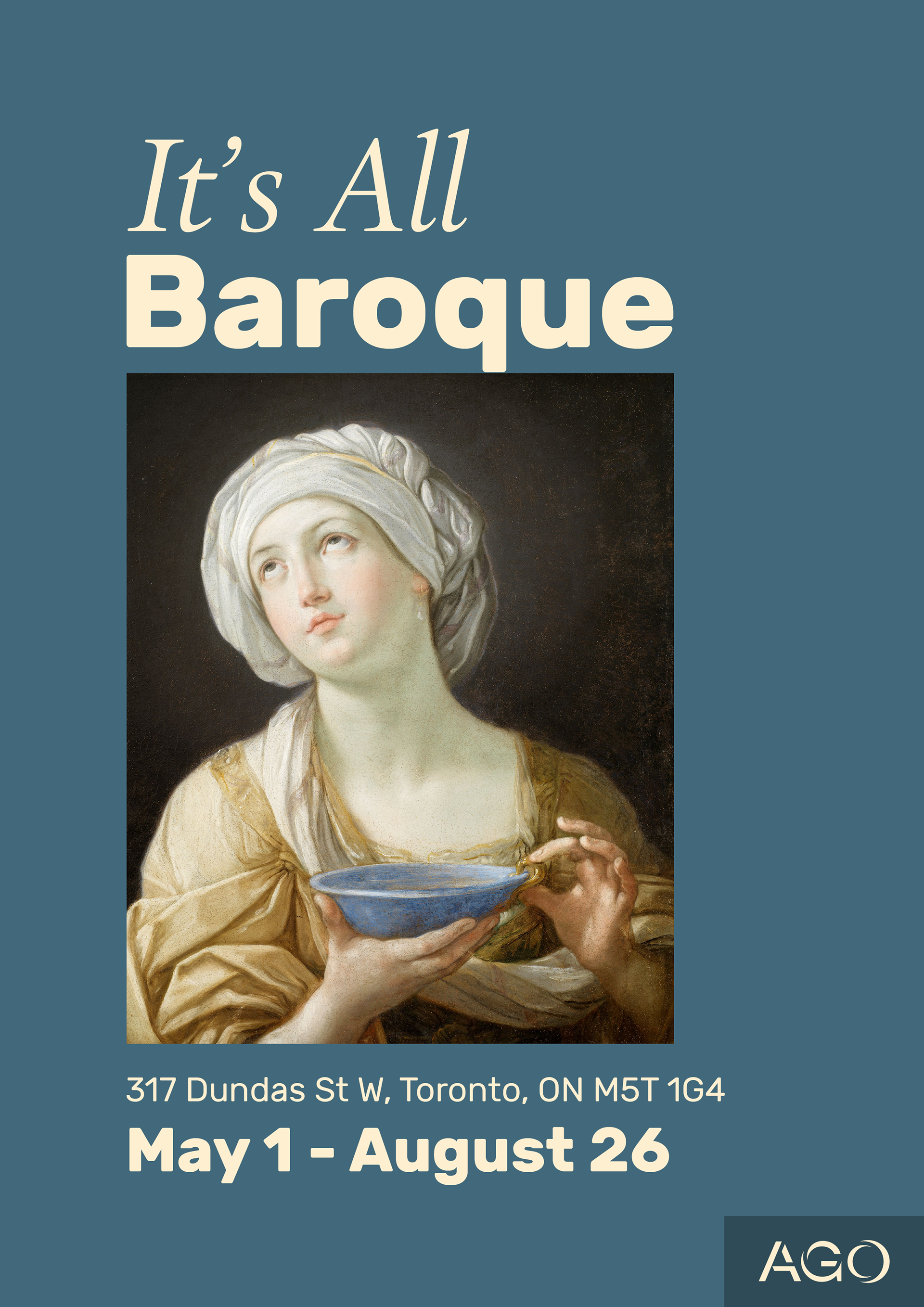
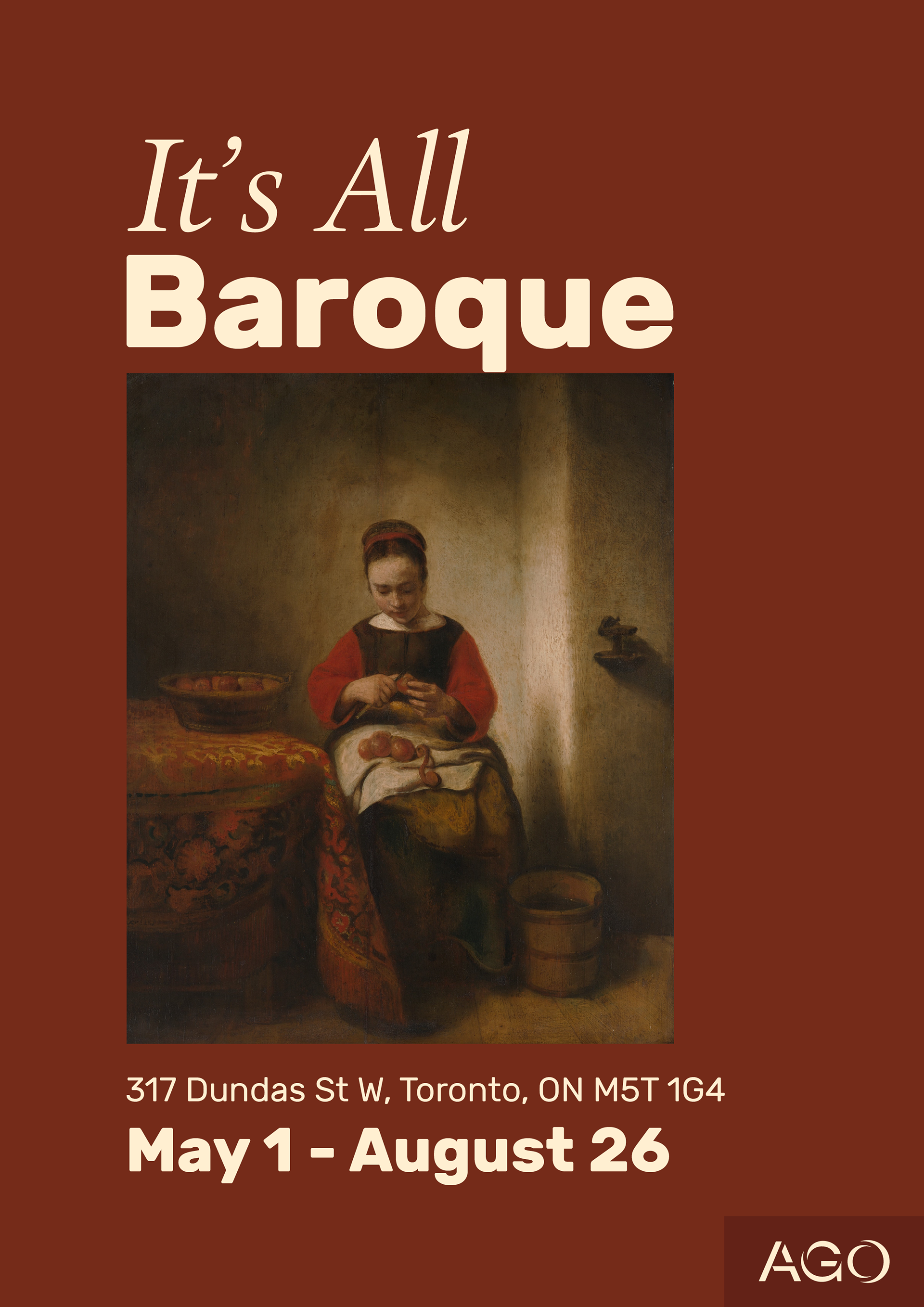
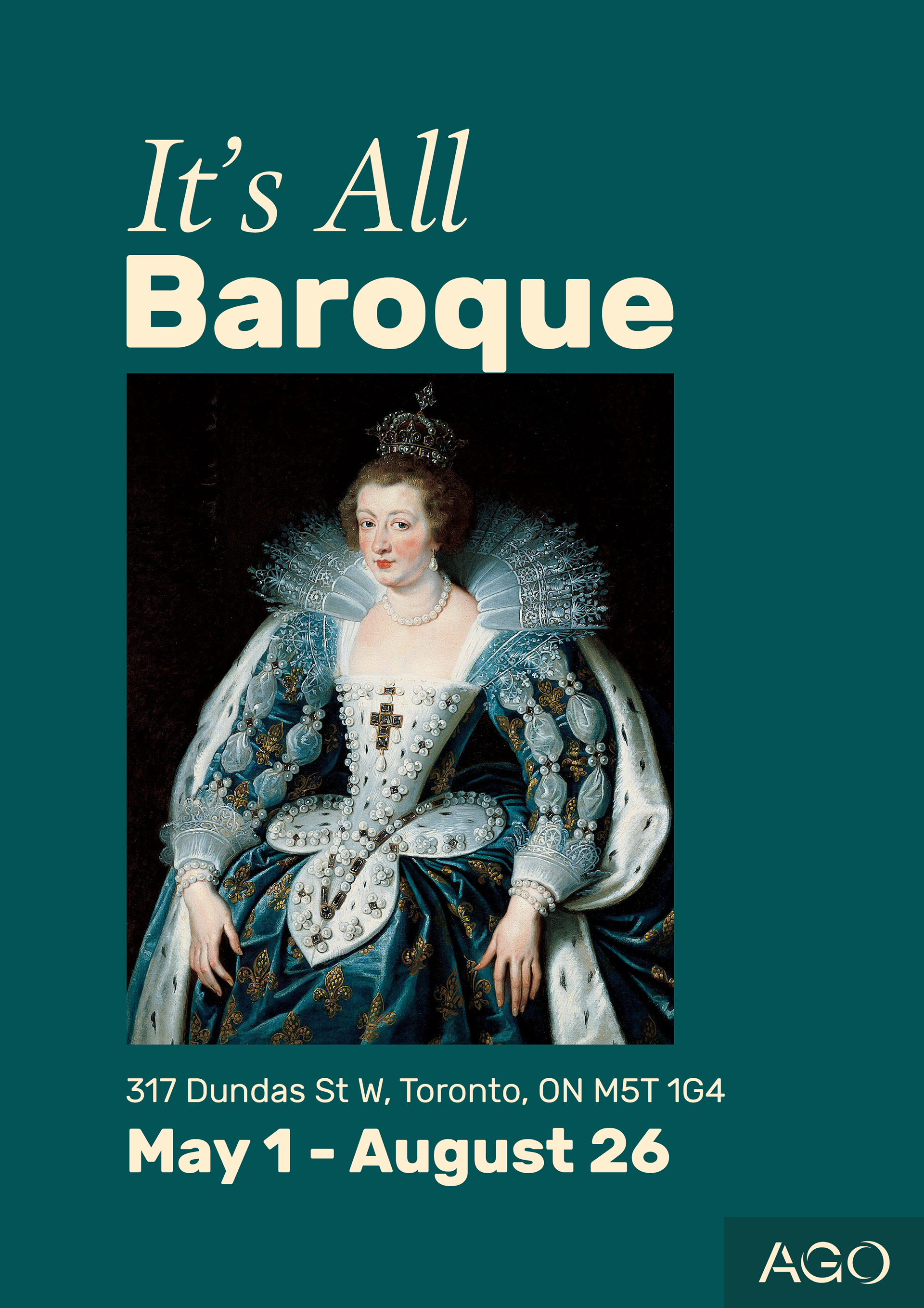
This project is centred around a new AGO exhibition showing art from the most prominent artists of the Baroque period. To make the recently acquired works shine, I needed to find a way to blend the old Baroque era style with the modern branding of the Art Gallery of Ontario while attracting regular and irregular museum-goers. And I did this by using colours that bring out the beauty in each piece and typography that gives a nod to the old and the new.
Colour Palette
Moreover, to ensure the paintings could easily grab a passerby's attention, I brought out colours found in the paintings to the background of the posters. For example, I used a blue colour similar to the one in the painting, with the woman holding the bowl as the poster's background.
Typography
To represent the old age of the paintings, I used a traditional font called Parklane. I also used a very modern sans-serif typeface like Rubik to represent the contemporary design of the new AGO branding. Additionally, by using both styles in the exhibition's title, I could show the old and new coming together in an interesting way.
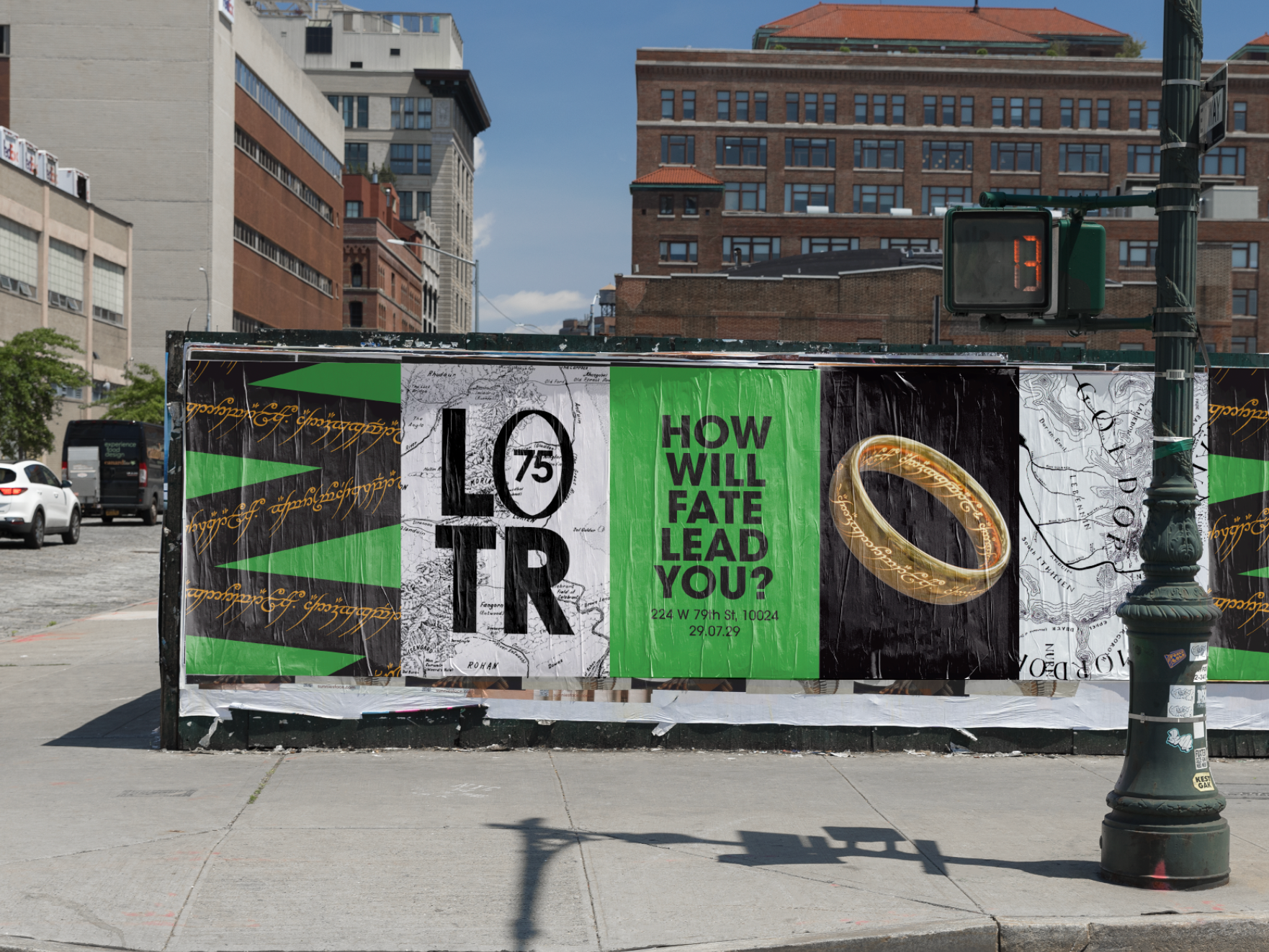
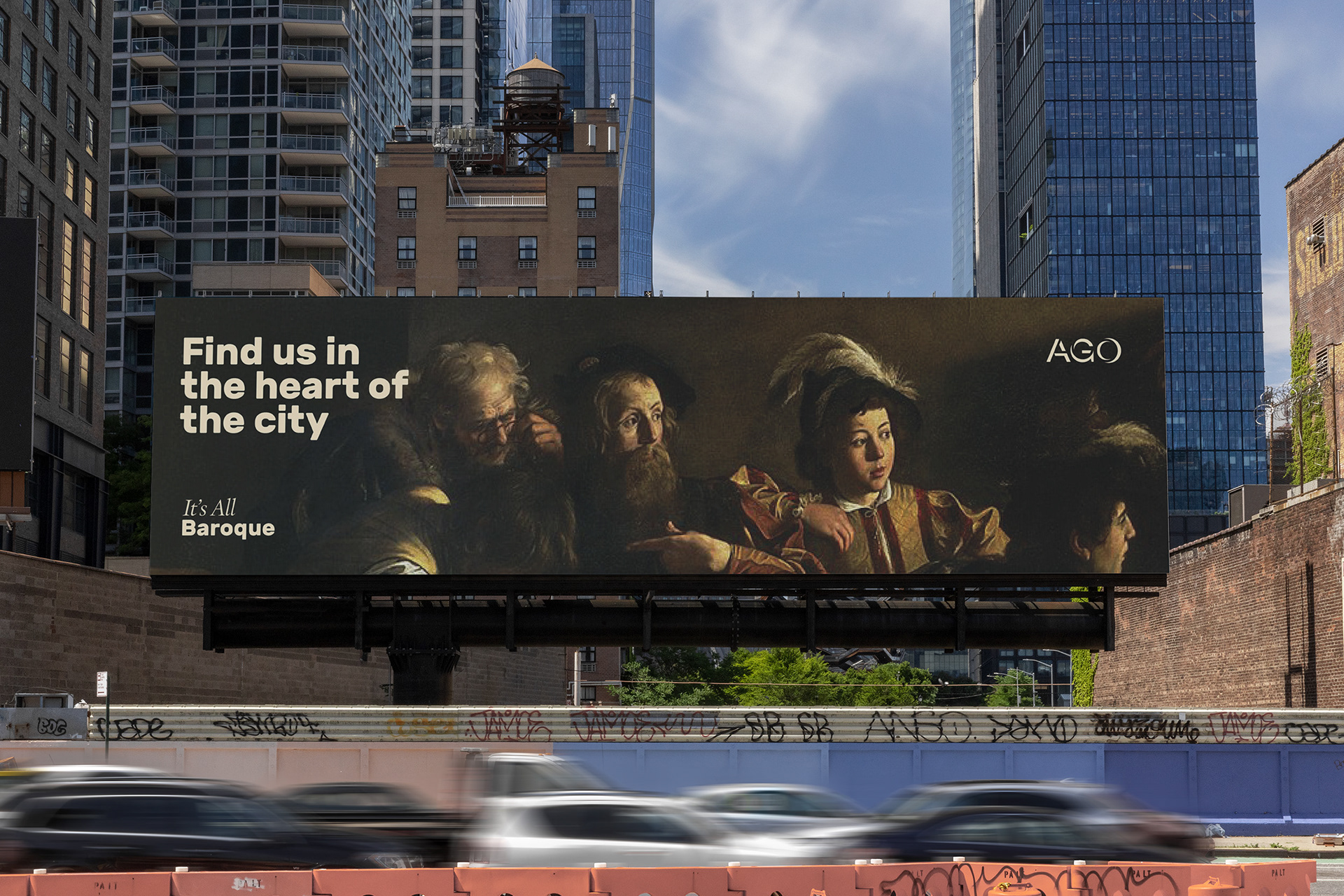
Out of Home
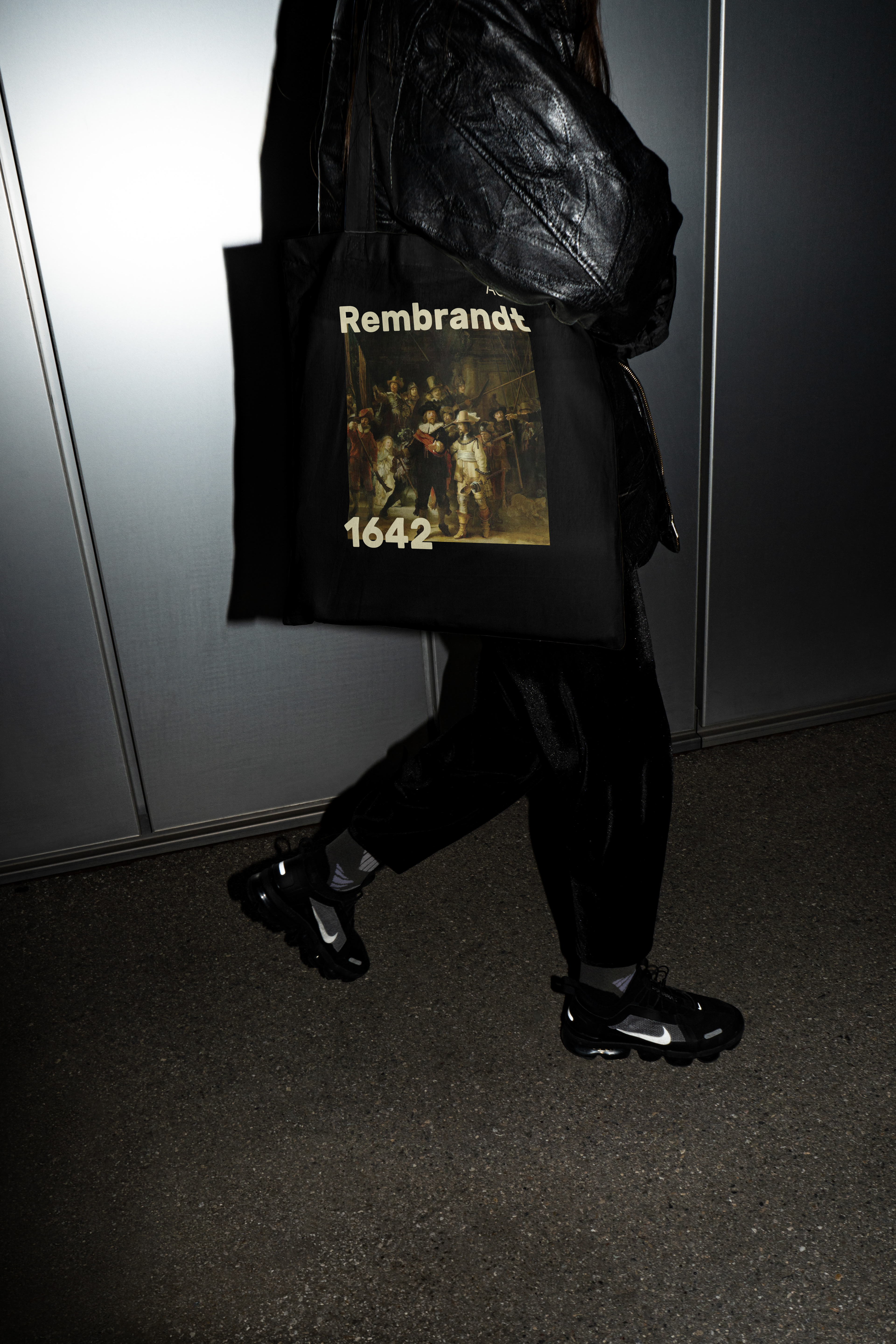
Merchandise
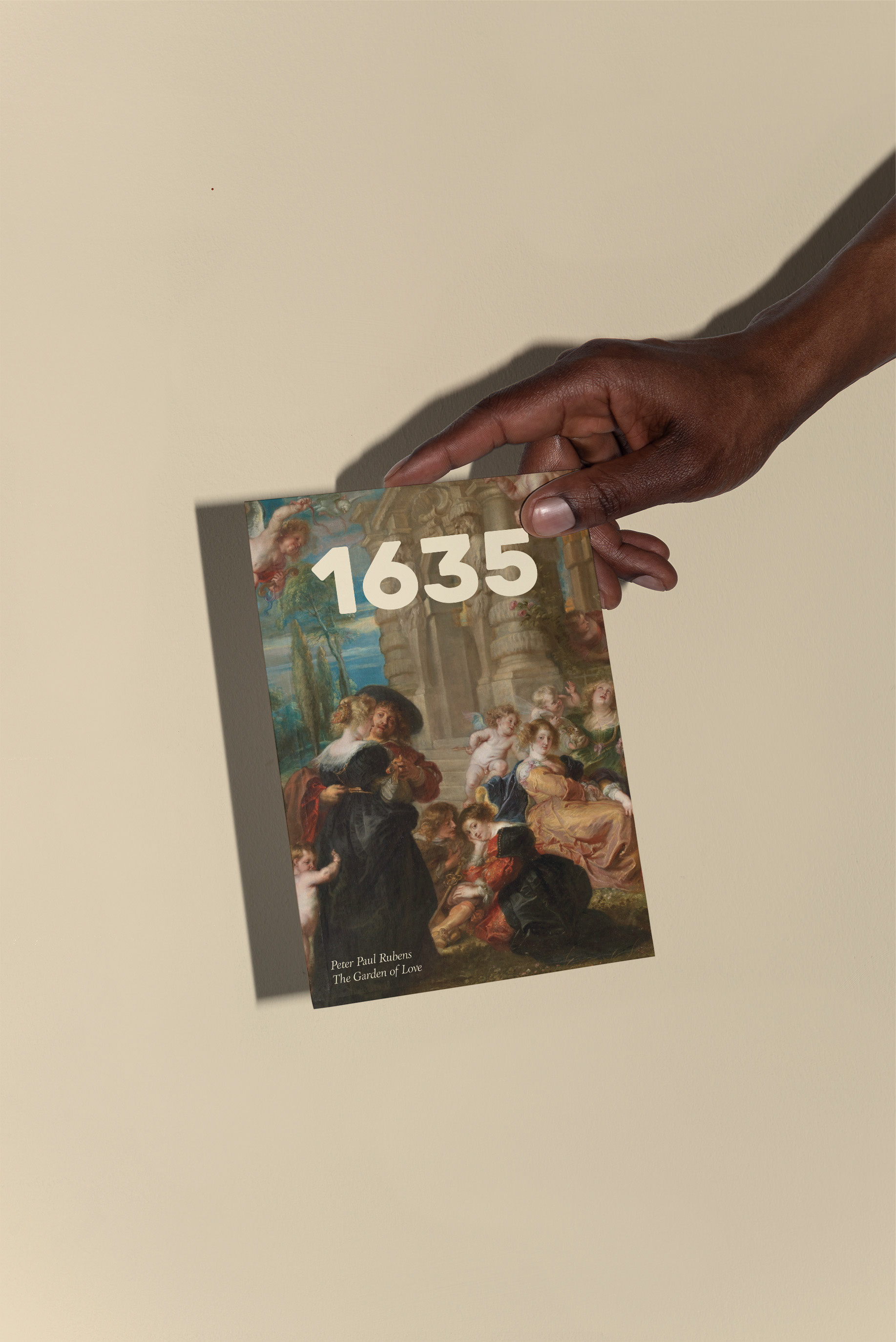
Informational Brochure
